Welcome to My New Site
My new website is live today! I am very excited about it, and after spending a significant amount of time trying to figure out how I wanted the site to come across to new and existing clients, I feel that the site is functional, represents my personality and my company, and is a place where others will feel comfortable browsing.
When I recently came across the “4 Signs It’s Time to Redesign Your Website,” according to the Online Marketing Institute, I realized how similar a website redesign is to redecorating a room in your home.
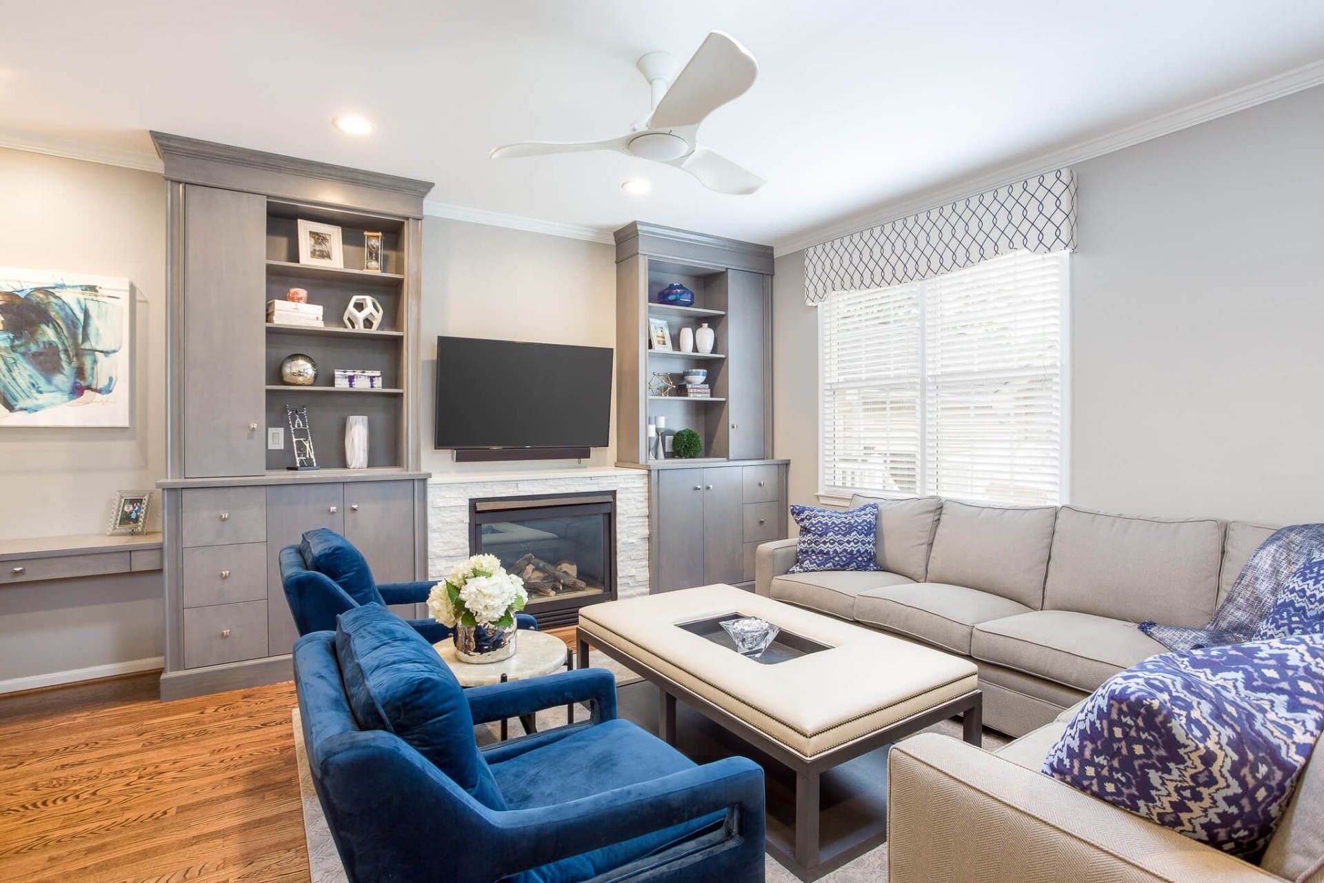
- Lack of responsiveness – I believe every room in your home should evoke some sort of feeling, depending on the use for the room. Does your bedroom make you feel relaxed? Is your family room comfortable for everyday living?
- Outdated Information – Just as you don’t want your website to be outdated in terms of content and technology, you also don’t want your home to be out of style, dated or tired. There are often easy updates that can be made, such as changing out lamps, throw pillows or a rug that will make a room more current rather than investing in a complete overhaul.
- Long Load Times – While a website shouldn’t take too long to load, neither should a room take too long to redesign. Many of the home shows on TV are unrealistic when rooms are redone in a day, but a good decorator should help the client make decisions quicker than if they were on their own.
- Visitor Loss – If you aren’t getting much traffic on your website, you know it is time to for a redesign. The same goes for your home – if you find your friends aren’t interested in coming over after inviting them several times, you might want to evaluate your space to see if guests aren’t comfortable with the seating, have no place to put down their food and drink, or feel relaxed when they come over.


